> For the complete documentation index, see [llms.txt](https://guides.noloco.io/llms.txt). Markdown versions of documentation pages are available by appending `.md` to page URLs; this page is available as [Markdown](https://guides.noloco.io/views/display/columns.md).
# Columns
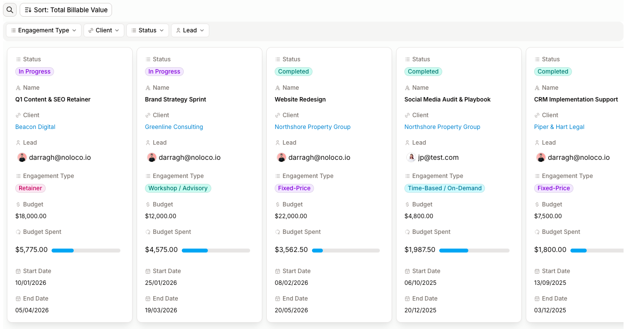
Display records as fixed columns with horizontal scroll inside each group.
The Columns layout displays records as cards arranged into fixed-width columns. Unlike the [Cards](/views/display/cards.md) layout — which wraps records to fill the available width — Columns keeps each group of records in a horizontal strip that the user scrolls across.
It's a good fit for dashboards, product catalogues with carousels, "featured" rows, and any layout where you want a consistent number of records visible per row regardless of screen width.
{% hint style="info" %}
**Cards vs Columns** — both layouts use the same card component. Pick **Cards** when records should flow and wrap across rows; pick **Columns** when records should sit in a fixed column the user scrolls through.
{% endhint %}
## Setting up a Columns view
The Columns Editor sidebar is split into a **Setup** section for layout-specific options and a **Grouping** section. See [Grouping records](/views/display/grouping-records.md) for the shared grouping controls.
### Card size
Choose how big each card renders: **S**, **M**, **L** or **XL**. Smaller sizes fit more cards in the visible portion of each column strip; larger sizes give each card more room for fields and imagery.
### Field icons
Toggle **Field icons** to show or hide the small field-type icons next to each field label on the card. Hide them (default) for a cleaner look, show them when users benefit from the visual cue.
### Style: Card vs Stacked
The **Style** selector controls how cards relate to their group:
* **Card** (default) — each record sits inside its own outlined card, with a small gap between cards within the column.
* **Stacked** — the outline and shadow move from individual cards onto the group itself, and the cards sit flush against each other with no horizontal gap. Useful for a denser, list-like presentation while keeping the column structure.
### Field display and links
For each field shown on the card you can choose how it renders (badge, plain text, etc.). URL fields can be configured to open in a new tab.
### Sort and limit
Sorting and limiting records keeps each column focused. Sort by a field (text A–Z, numbers ascending/descending, dates newest/oldest) and pick a per-column record limit so each column stays scannable.
Example: in a task board, sort tasks by Due Date and limit each column to 10 tasks so the layout stays easy to scan.
### Record limit and pagination
The **Loading more records** selector controls how users navigate beyond the limit:
* **On scroll** — auto-loads more records as the user scrolls.
* **Load button** — shows a "Load more" button with a loading state.
* **Pagination** — paginates the view, either with **Arrows** in the action bar or **Numbered** pages.
The action bar shows the record count (e.g. "Showing 25 of 240", or "25 of 240 results" when filtered).
### Grouping
In the Grouping section, pick the field that groups records into columns and choose:
* **Style: Colored** (default) **or Neutral** — controls whether column headers pick up the badge colour of the grouping option. See [Grouping records → Group Style](/views/display/grouping-records.md#group-style-colored-vs-neutral).
* **Multi-level grouping** — up to 3 nested levels.
* Per-group **expand/collapse** default and **Show empty groups**.
## Using a Columns view
### Scrolling and behaviour
* **Vertical scroll** down the page across multiple group rows.
* **Horizontal scroll inside each group** — within a column strip, users scroll horizontally to reach records that don't fit in view.
* Group headers stick to the top as users scroll past, with a thin shadow once the header is sticky.
* Click a group's header or chevron icon to collapse or expand it.
### Hover and inline editing
Hovering a card surfaces inline-editable fields. If a specific field is configured as inline-editable, hovering it overrides the card's general hover state so the user can edit in place.
### Buttons and actions
You can add the following to each card:
* **Navigation buttons** — link to internal pages or external URLs.
* [**Record action buttons**](https://guides.noloco.io/actions/action-buttons) — trigger actions or [workflows](https://guides.noloco.io/workflows/workflows#triggers) directly from the card.
* [**Record colors**](https://guides.noloco.io/views/display/record-colors) — apply conditional colours to highlight status, priority or category.
## Empty and special states
* **No value in the grouping field** — records appear in a neutral group with no colour applied.
* **Empty group** — when **Show empty groups** is on, an empty group shows a single "No items" card and collapses by default.
* **No matching records** — filtered views with no results show a general empty-state message.
## Troubleshooting
**Cards are too wide or too narrow.** The Card size setting controls the width. Pick S, M, L or XL until the layout fits.
**Borders aren't showing on cards.** Style may be set to **Stacked** — in that mode the outline lives on the group, not each card. Switch to **Card** style to outline every card individually.
**Records aren't appearing in the expected order.** Check the Sort settings — sorting is configured separately from the Columns layout itself.
**Some records aren't showing up.** You may have a record limit applied. Check the Loading more records setting in Setup and either raise the limit or switch the load behaviour to On scroll.
**A Navigation button doesn't work.** Re-check the URL or page link configured on the button.
**Record colors aren't applying correctly.** The colour rules need to match the field values exactly — e.g. "Status = Completed" must equal the field value, including case.
---
# Agent Instructions
This documentation is published with GitBook. GitBook is the documentation platform designed so that both humans and AI agents can read, navigate, and reason over technical content effectively. Learn more at gitbook.com.
## Querying This Documentation
If you need additional information that is not directly available in this page, you can query the documentation by asking a question.
Perform an HTTP GET request on the following URL with the `ask` and `goal` query parameters:
```
GET https://guides.noloco.io/views/display/columns.md?ask=&goal=
```
`ask` is the immediate question: it should be specific, self-contained, and written in natural language.
`goal` is what the user is ultimately trying to achieve, the reason they need the answer. Sharing it helps GitBook give you a better, more relevant answer. A goal is most helpful when it describes the outcome the user wants rather than restating the question. For example, with `ask=how do I create an API token`, a goal like `automate deployments from our CI pipeline` lets GitBook tailor the answer to that use case.
The response will contain a direct answer to the question and relevant excerpts and sources from the documentation.
Use this mechanism when the answer is not explicitly present in the current page, you need clarification or additional context, or you want to retrieve related documentation sections.